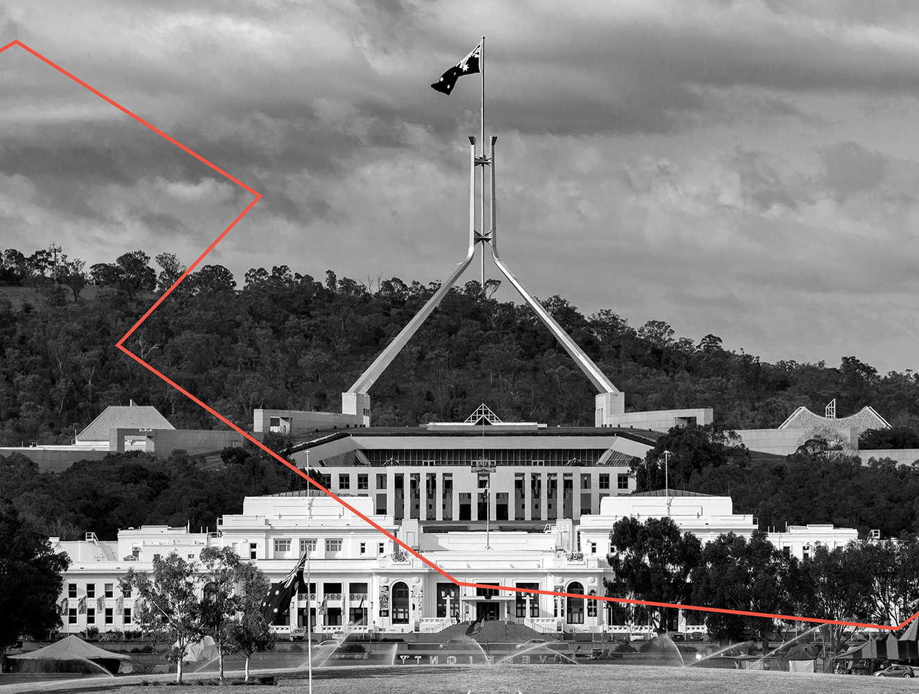
MoAD ??? Museum of Australian Democracy

brand architecture, naming, brand identity, strategy, campaign, environmental

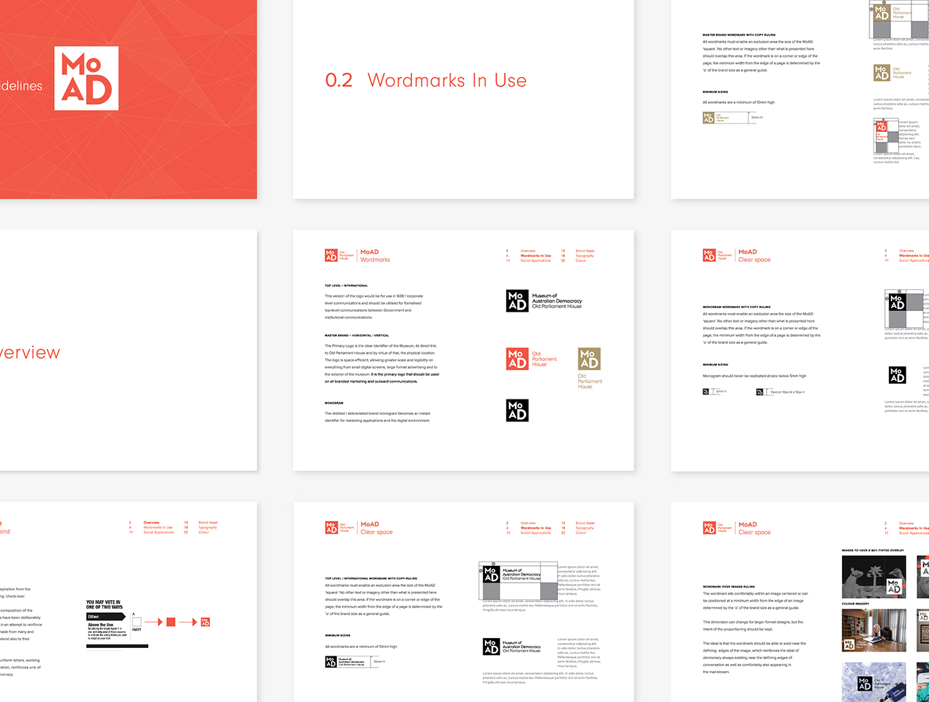
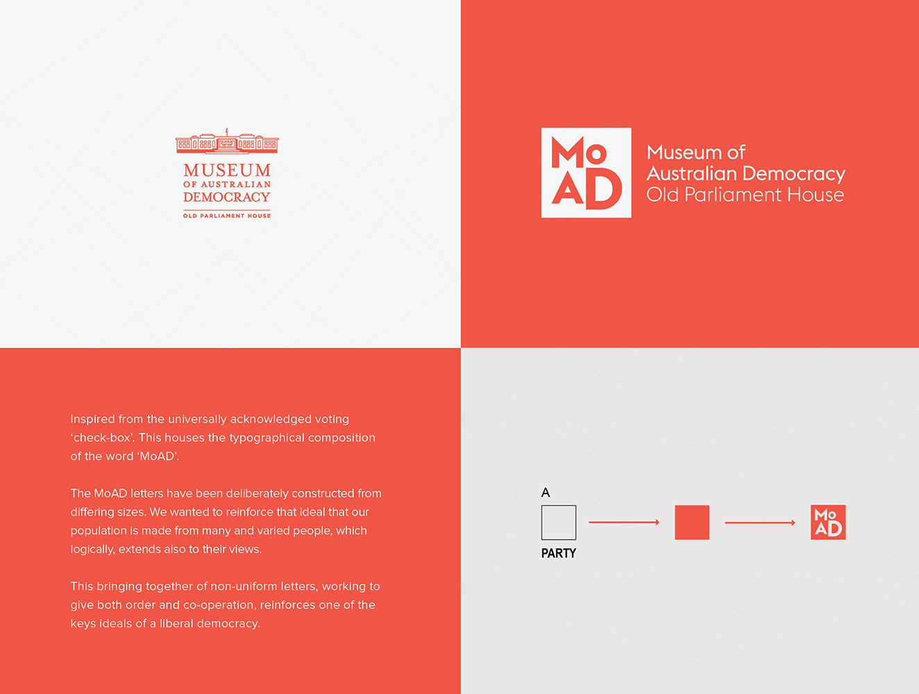
The mission was to take the Museum of Australian Democracy at Old Parliament House and create an identity that would make it an iconic, 21st century cultural destination for Canberra.

In early 2015 MAXCO was enlisted to oversee the strategic brand direction, reinvent the brand UX and overhaul all communication touch points.

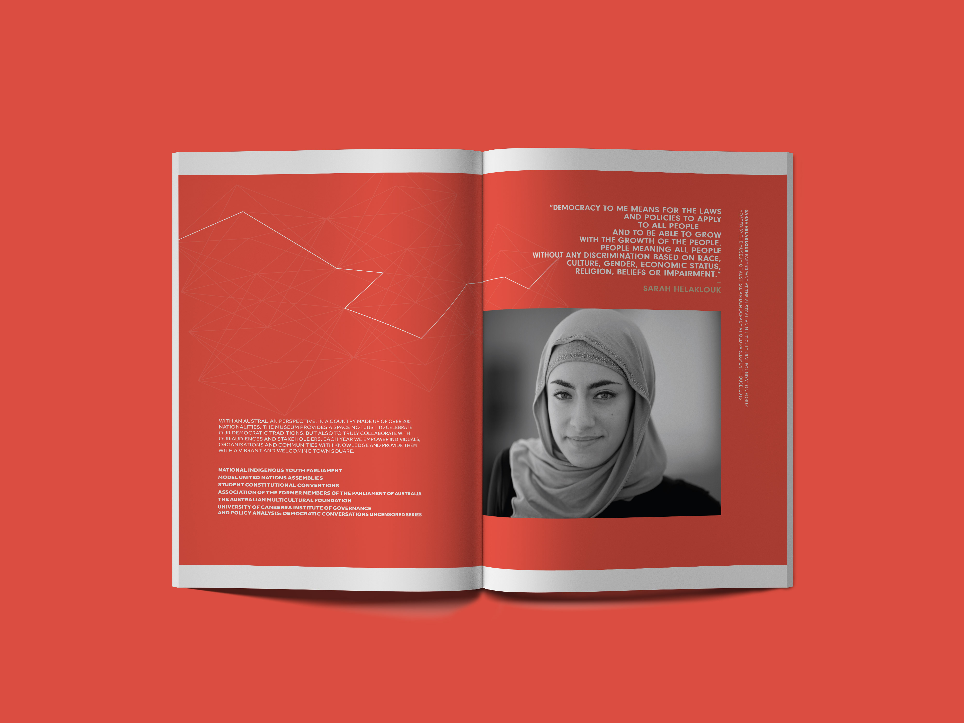
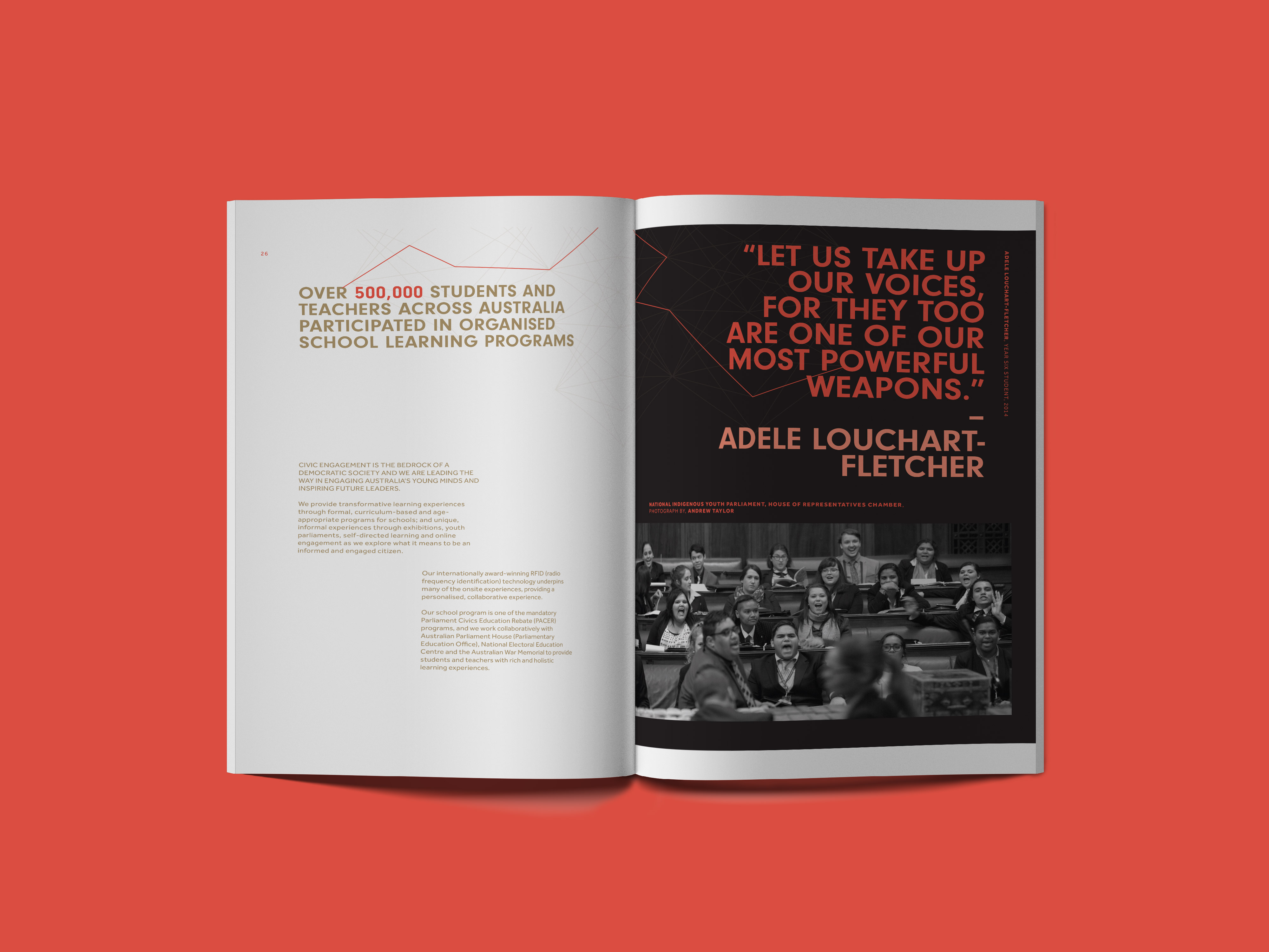
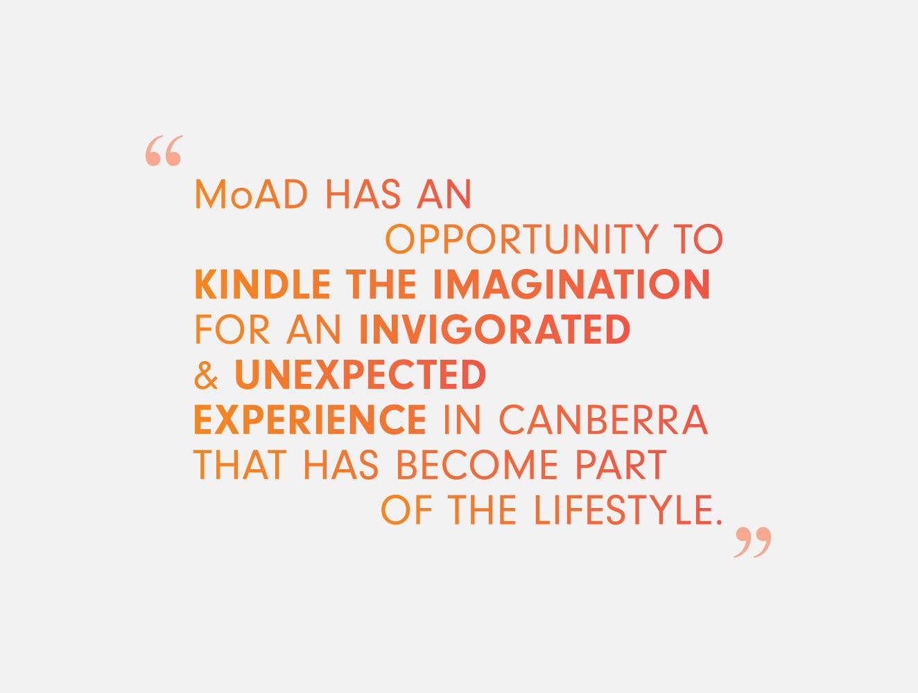
Work spearheaded a bold change in direction and focused on moving the Museum away from a rigid and conservative approach, to present the brand with a fresh new identity and unique touch points.

On 9 November 2016 MAXCO won bronze in the sixth edition of the International Design & Communication Awards (IDCA) for their work rebranding the Museum of Australian Democracy. AGENDA, a cultural agency based in Paris and Quebec, recognised the brand work for being fresh, fearless and in-step with global, best-practice.

Bangarra Dance Theatre Australia

brand identity, brand architecture, campaign creative, environmental, strategy

The objective was to create artwork as stylish and symbolic as this beloved Australian Indigenous arts institution. MAXCO sought to retain the iconic group???s respected sense of place, while transforming it into a bold and fearless brand that would continue to resonate into the future.

Working closely with Creative Director Stephen Page, MAXCO delivered a new brand and campaign in mid-2011 and went on to win the entire, creative account.

MAXCO began by stripping back the outdated brand ID and produced a contemporary stylised lower case ???b??? and an organic tracery that artistically suggested the marks of a dancer???s feet on clay.

The new ID draws powerfully from a sense of continuance, evoking the company???s strong ancestral, connection to country.

The new Bangarra brand was universally adopted with great admiration and was rolled out across all forms of media, {including flags displayed throughout the city of Sydney; around the surrounds of Sydney???s iconic Opera House; outdoor posters in Melbourne; and it was even included in the Commbank???s advertising campaign}. The new branding rapidly brought the company up to a realised level of awareness, and a new audience.

MAXCO developed this campaign for Bangarra with a very sparse creative brief. Through extensive research, bespoke photo-shoot and art direction to the enhancement of that shoot, the highly successful national campaign evolved.

This campaign helped Bangarra in achieving its all time record box-office sales of $1.3 million, audience growth at 34% nationally and the Sydney Opera House season of Patyegarang extended by a week.

social assets, Sydney Opera House digital assets, A format posters, Avant Card, city banners, Sydney Morning Herald print advertisements, outdoor advertising, The Australian advertisements, full marketing doc/guidelines, Sydney Opera House on-site signage, performance program, CD wallet, Sydney Morning Herald digital assets, Google digital assets, static & animated digital advertisements, Arts Centre Melbourne Collateral.

The Lore campaign was deliberately stripped back to pay emphasis to the ideal of story-telling through movement. We enlisted a new photoshoot for this campaign as we wanted to work closer with the organic nature of dance and movement.

social assets, Sydney Opera House digital assets, A format posters, Avant Card, city banners, Sydney Morning Herald print advertisements, outdoor advertising, The Australian advertisements, full marketing doc/guidelines, Sydney Opera House on-site signage, performance program, Jetstar advertisement, kiosk decal, CD wallet, Sydney Morning Herald digital assets, Google digital assets, static & animated digital advertisements, Arts Centre Melbourne collateral, Melbourne sky breakers.

FEROS Group

brand identity, brand architecture, digital design, strategy

Brave and category defying, The Feros Group rebranding delineates a new era in the history of this family owned hospitality business.

MAXCO edited and reinvented The Feros Group brand, introducing a new brand family to host a large suite of fresh locks up. These include MAXCO re-imagined and re-designed brands for; Highfield Caringbah, Public House Highfield, The Botanical, Gerrale Street Bistro; The Prince; Sarita???s; Huxley, Ugly Pizza and Rocks Hotel.

The new feel delineates a new modern era under the stewardship of Chris Feros as Director and CEO.

CRE

naming, brand architecture, brand identity, enviromental

Agents James Giltinan and Irene Dermatis offered MAXCO a blank slate upon which to build an entirely bespoke, people-focused real estate brand.

MAXCO elicited a fresh and crisp brand for CRE that addressed all brand lockups, the entire web strategy and all social media assets. The CRE brand speaks to its sense of place in the community and references the unique lifestyle that reflects the agency???s coastal locale.

CRE???s rebranding has made it quickly become one of the best-known agencies in the local area, embraced as a truly customer-oriented business.

Here you can create the content that will be used within the module.

TNA

brand identity, brand architecture, digital design

The aim was to subtly reinvent a well-known Sydney PR agency adding modern, defined branding to attract local and international clients, and create a competitive advantage.

MAXCO suggested a name change that would speak to the ambition of Trish Nicol???s clients, and created a logo to lock up the power and impact of the other three words. The communication and website are both elegant and intelligent, making it the perfect branding to host it???s sophisticated clients.

MAXCO produced new brand, logo, social logos, style guide, business cards, folders and bags with website that rolled out on November 2017.

H&E Architects

brand identity, brand architecture, digital design, strategy

Humphrey & Edwards Architects sought an elegant and timeless brand to propel them forward into a period of high growth and success.

MAXCO took a minimal approach, refining the brand???s logo back to its essence and paring away all superfluous details. They delivered a full web site, brand architecture and professional, contemporary design look and feel for all H&E???s brand assets.

A brand that is widely respected in the hospitality, design and architecture industries. H&E???s brand is contemporary and considered – reflecting the two partner???s originality, creativity and symbiosis.

Here you can create the content that will be used within the module.

Solotel

brand identity, brand architecture, brand management, environmental, digital design, strategy

MAXCO worked with Solotel creatively and strategically to reinvent their Corporate Web development giving it a dynamic, resonating presence.

Creating new identities for the Riverbar in Brisbane and Sackville Hotel, Quay Bar, Green Park Hotel, The Clock Hotel, The Chelsea Hotel, The Bank Hotel and The Albion Hotel in Sydney MAXCO transformed brand perception by advising on brand, evolving in excess of eight venue brands along with a large amount of web development for the group.

MAXCO is currently reworking with pinnacle brands within the group???s portfolio including ARIA and Chiswick, that will launch early 2018.

SmartHealth

brand identity, brand architecture, campaign & creative, environmental

Smart Health had a vision to launch an online business that took a frontline healthcare facet and offer it as an online test order – in simple terms ???Pathology made easy???. This had been done overseas in differing ways, but it was a first for Australia. Consultation with key industry groups was needed to ascertain the direction we would need to take to sell the product and create the brand visually.

MAXCO partnered with the newly formed Smart Health group creating seed funding documentation, concept development/evolution, brand creation, web / UX design and marketing. We were initially challenged with creating a brand for a radically new service being offered online. It had to be approachable, considered and reflective of the industry sector (medical / pathology). The brand drew inspiration from the forms viewed under high powered microscopes. Dimensional depth was added to the geometric forms reinforcing the nature of the business.

The concept was adopted by Sonic Health and rolled out into a national online launch. A full online media campaign was married with public transport advertising and cross track 24 sheet posters. Smart Health wellness screening is now a viable business sector for Sonic Clinical Services.

Canberra Writer’s Festival

brand identity, brand architecture, campaign & creative, environmental

The challenge was to develop an iconic and highly adaptive brand, that would be readily embraced by the greater community of Canberra, the seat of politics and journalism in Australia.
MAXCO developed a visually engaging signature which was drawn directly from the capital???s public architecture. First MAXCO looked to the National Carillon as a source of inspiration, working with it Brutalist form, structured in three parts.

Impact

The final branding for the festival is strongly geometric and iconic. The line work makes reference to the three pillars of the festival: Passion, Power and Politics, giving a nod to the pages of a book and pay homage to an iconic Canberra landmark. The final brand is extremely classic in style and is one that can grow and evolve confidently from year to year.